Mar 8, 200
Digital Strategy and Website Redesign
In 2015 Exygy was selected to produce a Digital Strategy Report for HSA. We began by conducting an analysis to assess the current landscape. The analysis utilized a combination of quantitative and qualitative metrics to understand the efficacy of the current site and identify pain points in the user journey. To do so, Exygy reviewed the current site user traffic patterns, led one-on-one user interviews, conducted an online survey on the website itself, and held multiple community workshops with 47 clients and 6 partners.
Upon the successful delivery of the report, HSA renewed their partnership with Exygy for a second phase: to implement the recommendations from the report in a massive website redesign, including the migration, editing, combination and removal of over 6000 pages from the old website to a new one. Exygy led a multi-partner team to rebuild and relaunch HSA’s digital client-facing services platform by designing the user experience and visual interface, developing the site frontend and backend content management system (CMS) in Drupal, and leading the content strategy, training, and authoring. The new site launched in 2017 and is the foundational component upon which HSA is now iteratively launching new digital-based services.

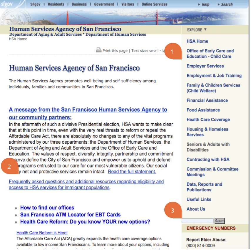
HSA’s old website was created before the proliferation of many technologies we are accustomed to today. We took a deep dive into analyzing the existing website.
Things we noted immediately:
An overall lack of content hierarchy.
A dense wall of text with no translation options.
A buried Search button that was hard to find and returned irrelevant results.
USER CENTERED AND DATA DRIVEN APPROACH
HSA plays a paramount role in serving the needs of diverse audiences. HSA is a large civic agency housing dozens of social programs with unique identities. With more than 30,000 unique visits to sfhsa.org each month, the digital strategy had to accommodate multilingual users, be accessible on desktop and mobile devices through a responsive design, as well as consider the technical ability of content providers using the content management system (CMS). Exygy’s user centered approach throughout the project ensured that the public facing website provided information and services in a clear, helpful, effective way with the utmost dignity and respect for the client experience.
User Interview: Exygy was diligent about talking with representational HSA audiences to get their unique perspectives. In addition to HSA clients, we interviewed staff from Family and Children’s Services, The Department of Aging and Adult Services, The Office of Early Care and Education, The Department of Human Services, the Information Technology Department, Internal Affairs, and Executive Leadership. Hearing from all parties and stakeholders provided a broad understanding of the agency, its partners, and its constituents. With this information, we were able to get granular and create an informed strategy.
Community Workshops: To reach a broad audience, Exygy held 3 community workshops at the SF Public Library Main Branch and at Arriba Juntos, a non-profit located in the Mission district. 47 clients and 6 Community Based Organizations (CBOs) attended the participatory workshops. Attendees shared how they were currently using sfhsa.org, what was missing from that experience, and what they would like to see in a new website. We gained insights into some of the nuance of how HSA users accessed digital services - using the public library, computer labs, or via counselors at CBOs. These insights were critical in informing our user journey maps and the subsequent service flows. Community workshops are a powerful tool that allow us to broaden our reach and understanding of demographics we otherwise wouldn’t be able to learn from - workshops with CBOs allow us to meet users where they are.
Testing and Metrics: Exygy used event tracking data to measure how visitors arrived at the site and once there, how they behaved. We began tracking what visitors were searching for using the site search engine and what results the site was offering in each case. We were able to group together many search queries that were returning zero or irrelevant results, informing us of what users were looking for that they weren’t finding. We also learned that only 10% of users enter the website through the homepage, informing our recommendation for site design, information architecture, and navigation.
WIREFRAMES
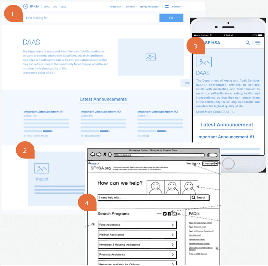
Exygy created wireframes for key HSA pages based on the outcome of user interviews and user flows. The pages represented a new homepage, “lobby” pages that displayed Services and Programs, Search results, and legacy pages that would house content transferred from the old site into the new platform.
Our new layout proposed:
Prominent Search bar at the top of each page. Throughout the content strategy and migration, we diligently tagged metadata (i.e. keywords) on all content types so the search results were accurate. The content strategy considered less intuitive content structures: a user searching for “Food Assistance” ,“food stamps”, “I need food assistance” would be routed to CalFresh, the state food program.

Simplified “card” layout to easily distinguish content areas on the page. A content audit and content strategy was developed in partnership with HSA to reword language to reading levels appropriate to the HSA general audience.
Scalable responsive design for mobile devices and tablets.
Example of a low fidelity initial wireframe sketches.

VISUAL DESIGN - MOOD BOARDS
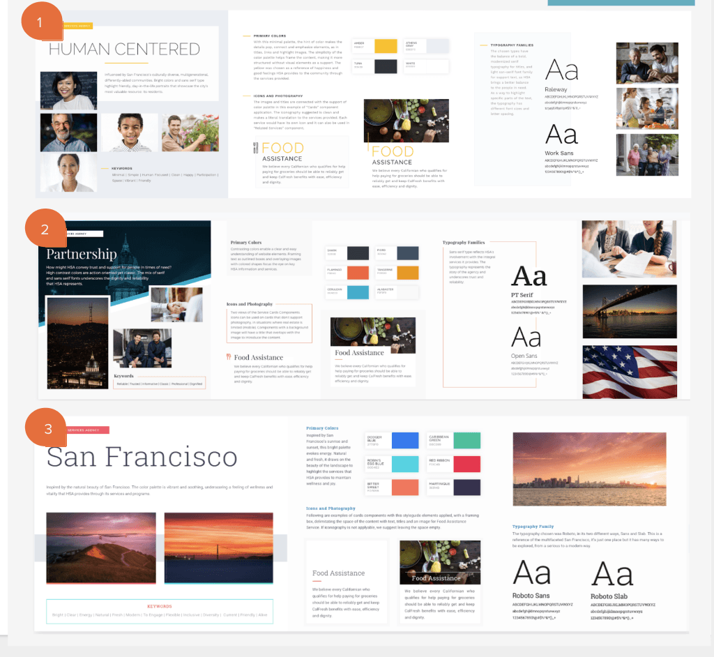
Exygy designed 3 inspirations for a new look and feel for HSA:
Human Centered: This design concept focused on HSA’s diverse audiences, representing multicultural and intergenerational users.
Partnership: Trust and Integrity were key inspirations that informed this design, noting the agency’s civic mindedness.
San Francisco: Inspired by San Francisco’s natural landscape, this design has softer colors and features calming imagery.
CONTENT MANAGEMENT SYSTEM
In the Digital Strategy Report we recommended two CMS options, providing pros and cons for each. HSA decided on Drupal.
Why Drupal?
Drupal is a web application framework that is most often used as a content management system. Drupal offers a user-friendly way for anyone to create and edit content on a web page, no technical knowledge required. Drupal is also highly extensible—it’s easy to add functionality using a wide selection of community-contributed modules. Drupal gives you all the advantages of an open source project - it is supported by tens of thousands of developers worldwide, who provide bug fixes and security updates on a faster basis than closed-source projects. Open source also means no licensing fees or vendor lock-in.
ITERATIVE
Exygy’s Agile philosophy guided our project management via a layered, sprint-based, process. This structure was critical for keeping on schedule and prioritizing deliverables during both the Digital Strategy Report and the Website Redesign. For the website redesign, Exygy had an integrated team approach to the build. Engineers, designers, and the project manager worked together to produce the deliverables. Engineers collaborated with designers to implement their mockups in code. The project manager ensured that the build continued to be centered around user and stakeholders need, followed the project vision, and addressed business constraints. Our team followed a Scrum methodology which provided HSA a high level of transparency and visibility into the progress of our work as well as a clear set of deliverables for each sprint. The deliverables at the end of each sprint formed iterative releases that were tested with a small group of users and rolled into a final launch.
USABILITY TESTING & FEEDBACK
To validate our design direction, Exygy created prototypes for HSA key webpages to place in front of users. The usability tests consisted of an introduction, a short interview, scenarios and tasks. We met the users at community partner locations where possible. Users either tested on their devices, on devices provided by the community partner, or one of our own devices we brought with us. We instructed the participants to think out loud and share their thoughts with us throughout the test. Sessions were performed on an individual basis with 47 users, each session lasting approximately 20 -30 minutes. In addition the a broader HSA audience, we were intentional about testing with multilingual users, older adults, and veterans. For accessibility, Lighthouse for the Blind connected us with visually impaired users who we observed using the site with screen readers.
We continued testing after each sprint, which created a user testing feedback loop that helped HSA and our team understand how well the project was serving users seeking HSA services and information. With each iteration, we made informed decisions that were validated by testing, guiding next steps for design and engineering. Feedback was received not only from HSA users but also from stakeholders and internal staff.
Exygy became embedded in HSA’s domain—understanding the complex nuances of the agency and its broad user base—before jumping to quick-fix solutions. Through a collaborative journey of analysis and user centered processes in the Digital Strategy Report, we confidently made recommendations for a website redesign plan that considered HSA’s current and future organizational capacity:
Our CMS platform recommendations were shared with HSA’s IT team, as well as the SF Department of Technology, to gain insight into a sustainable implementation during production and post launch. We considered many CMS options, but decided on Drupal or Wordpress and gave pros and cons for each.
Our staffing recommendations called for a cross-functional content, design, and engineering team. We looked at the makeup of the HSA Comms team and filled in the blanks for roles which were missing. During Phase 2, HSA hired a Director of Communications to work with our content team for a phased approach to content governance and training.
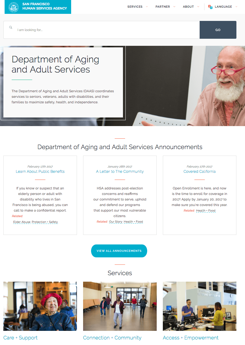
After a successful completion of the Digital Strategy Report, HSA renewed their partnership with Exygy. We’ve implemented recommendations from the report to iteratively design and build the new sfhsa.org platform. The redesign provides information and services through an multilingual, user focused experience. Under the hood, the 508 compliant site is accessible on all major browsers and devices. The new website guarantees that HSA services will be easily accessible to those 20,000 residents who need it the most. In addition, HSA staff and leadership is empowered to update content in a WYSIWYG CMS that is tailored to their needs. The website was launched in October 2017.
